Editorial / Magazine Design
Volume 34 · Issue No. 10
Wanderlust
A concept travel magazine — designing the masthead, grid, and type system that carry a long-form feature from a full-bleed cover through to its closing spread.
Most travel content is built to be skimmed. Wanderlust is the opposite — a print magazine designed for one long, unhurried read, where classic editorial typography gives the story room to breathe instead of racing to the next tap.
The issue is built around a single feature — What To Put In Your Travel Bag — so the design brief was narrow and honest: make one cover and one spread that feel like they belong to the same considered, newsstand-quality magazine.
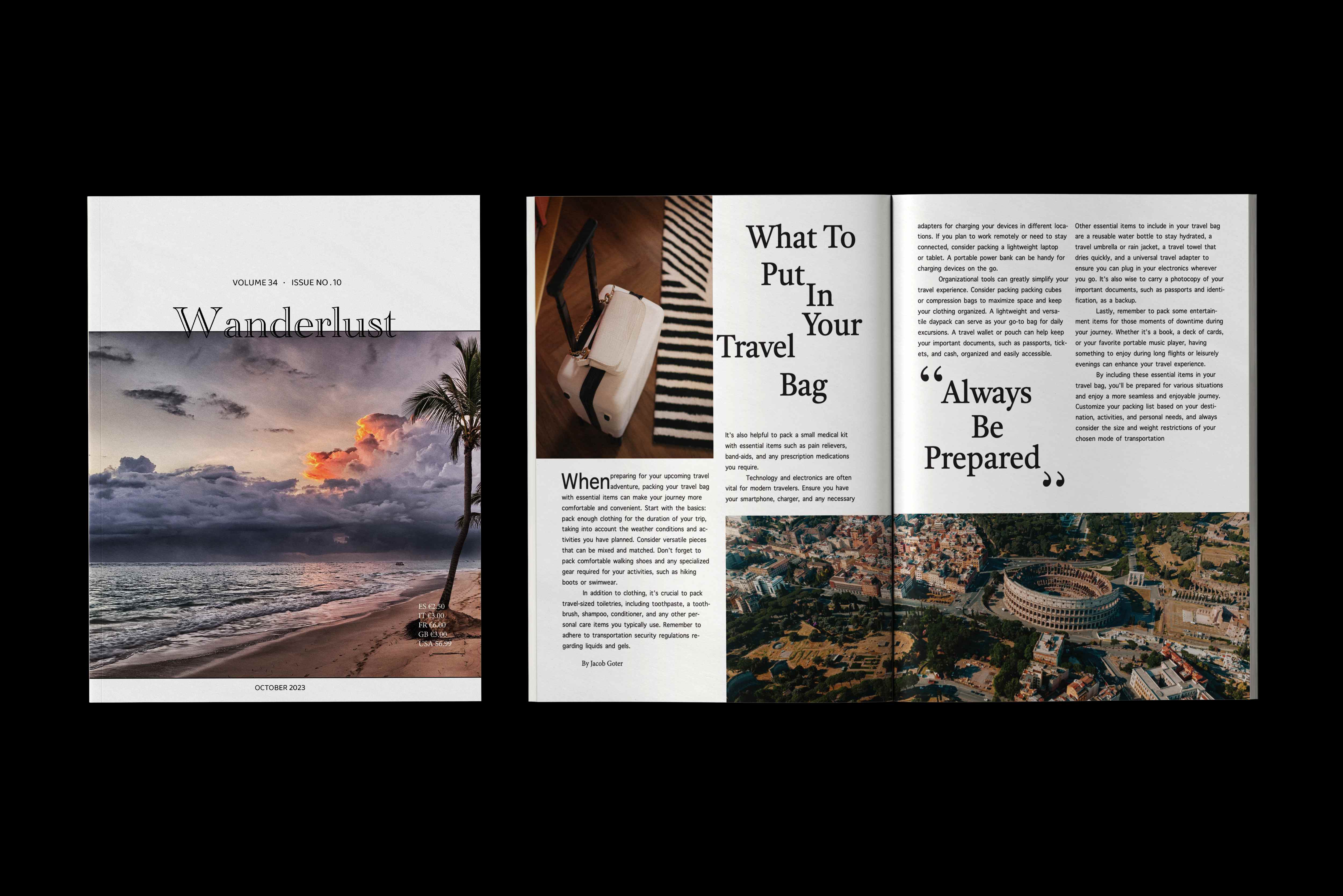
The cover leads with a dusk beach photograph and lets a thin, high-contrast serif masthead sit quietly across the top — restrained where most travel titles shout. Volume and issue numbers, the cover date, and a full newsstand price panel do the rest of the work.
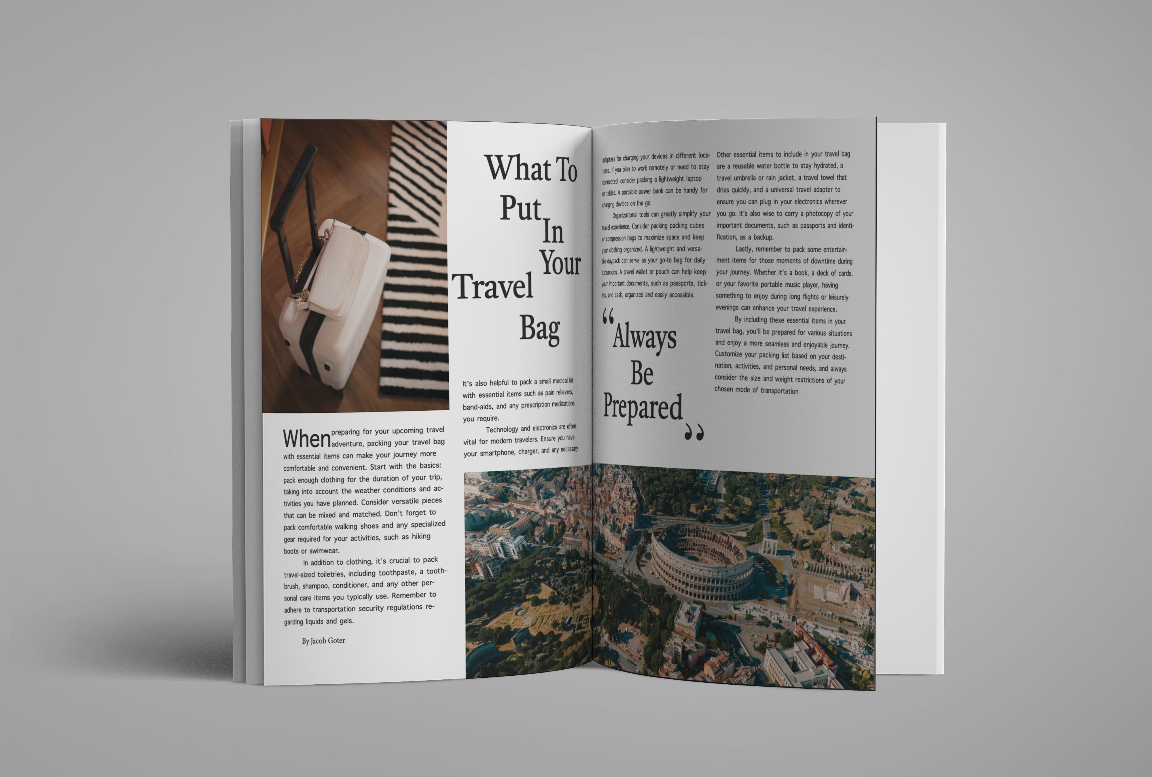
The feature runs on a narrow multi-column measure with justified body copy — the dense, classic magazine setting. Photography breaks the grid deliberately: the Colosseum runs full-bleed across the foot of the spread while text holds the top two-thirds.
A single high-contrast serif, Playfair Display, does all the expressive work — a light weight for the masthead, a heavy weight for the “What To Put In Your Travel Bag” headline, and an italic for pull quotes. Source Sans 3 keeps the justified body copy and captions quiet and legible.
The system is deliberately monochrome: black type on warm uncoated paper, with every hint of colour reserved for the photography. It keeps the reader’s eye on the images and lets the type stay timeless from cover to colophon.
The spread opens on a heavy serif headline stacked over four lines and a photographed carry-on, then drops into justified columns with a raised initial. A packing checklist becomes long-form editorial: what to pack, how to organise it, and what to keep close.
At the turn, a full-italic pull quote resets the pace before the eye lands on the full-bleed aerial of Rome running along the foot of the spread.
“Always Be Prepared”
The finished concept issue holds together: a restrained cover, a dense justified feature, and a single expressive typeface pulling the whole thing into one voice.
It’s the editorial muscle behind everything else I design — deciding what earns the reader’s attention, and giving it the room to hold it.